Editorials
The Topography of Typography: Mapping a Silent Narrative
Learning to read is a major developmental milestone in children’s lives. Some of us can remember that moment of revelation, when the abstract shapes on the page suddenly rendered up their meaning.

Some of us cannot recall learning to read; for as long as we can remember, the spoken and written words are inextricably entwined.
Yet once we achieve literate fluency, a strange transformation occurs in the way we perceive the world. The physical form of a letter — its curves, its weight, the sharp serif of its foot — almost vanishes, to be replaced by the semantic meaning it represents. We no longer see the ink; we see the idea. A famous paper by psychologist John Ridley Stroop illustrates this transformation perfectly. “The Stroop Effect” is where the brain experiences a significant delay when asked to identify the color of a word if that word itself names a conflicting color. Try it for yourself in the following: say aloud the color in which each word is written:
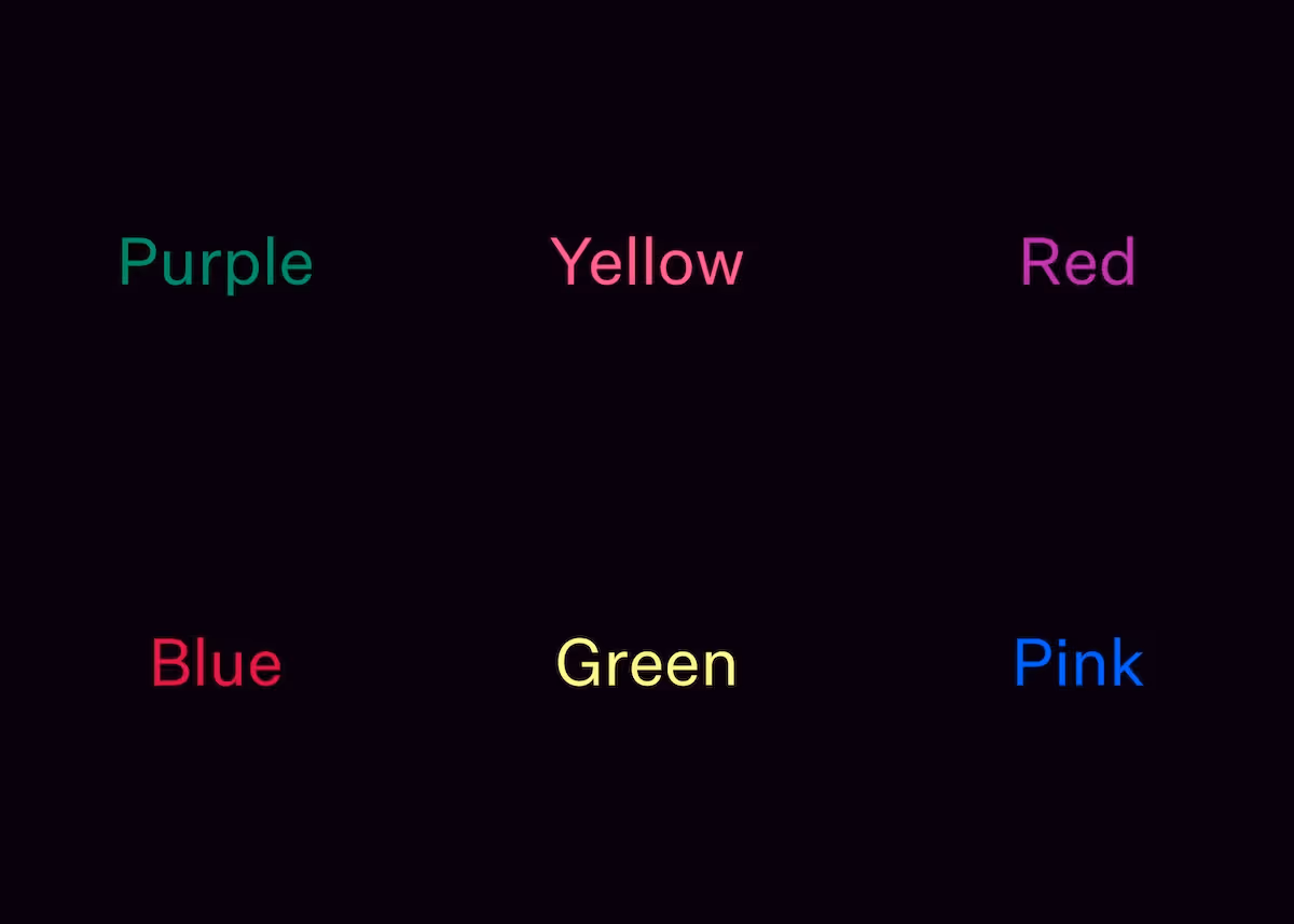
The difficulty we have in doing this reveals a fundamental truth about our relationship with language: the semantic meaning is so dominant that it overrides our sensory reality. This represents a challenge to art book designers who need to find a way to honor the text not just as a vessel for semantic information, but as a structural, visual landscape that exists in conversation with the imagery it frames.
In the early stages of book design, before textual content has been finalised, this tension between sight and meaning is particularly evident. When laying out a page, one might be tempted to use random content from anywhere. Yet our brains insist on understanding the semantic meaning of the words, which can be jarring if they represent something completely different to the topic and theme of the actual book.
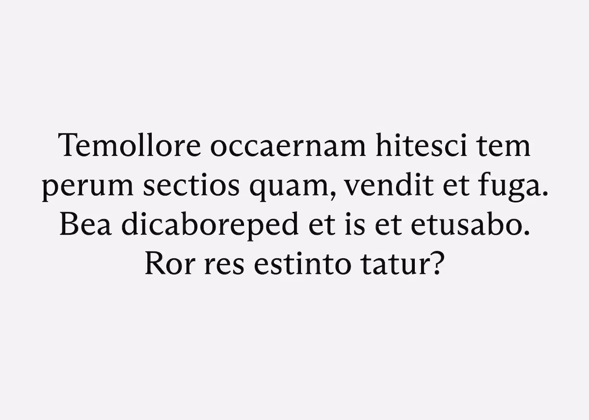
We could try a simple string of "xxxxxxxx" to represent a block of text, yet this fails the design at its most basic level. A line of identical characters lacks the topography of a real language; it has no valleys, no peaks, no rhythm. It is a flat wall rather than a textured terrain.
This is why designers have long relied on simulated languages like Lorem Ipsum. These "pseudo-languages" provide the necessary visual noise—the specific frequency of ascenders and descenders, the varying widths of characters, and the essential "gray-scale" of a paragraph—without triggering the brain's semantic reflex. It allows the designer to see the text as a shape, a weight, and a density, ensuring that the typography "maps" onto the page with the same intentionality as the photography itself.
For Daniel Zachrisson, Lebled Soloviev Editions’ head designer, this intentionality is the foundation of the craft. He references the philosophy of famous jazz musician Thelonious Monk: "Mean every note." Any choice must be grounded in a coherent concept and played with emotional conviction.
Zachrisson transposes this musical ideology onto the architecture of each page. Every choice must have a reason, avoiding decorative elements that serve no purpose, for example. For Lebled Soloviev books, he explains, “we rarely work with typography in a clearly expressive or attention-seeking way.” Instead, we are selecting the atmospheric conditions — the climate — for the reader’s journey. The typography must act as a sophisticated frame, refined and authoritative, yet possessing a quietude that allows the visual art to remain the primary subject.

Human perception is a complicated thing. Far from being passive receivers of information, our brains are active architects. We are constantly building mental maps, often rejecting reality in favor of what we expect to see. (Most optical illusions work by exploiting this tendency, illustrating how the subconscious brain persists in creating the illusion, even when we consciously know what it is we are really looking at.)
Typography can be a vital part of maintaining the coherence of that mental map, and the immersion in the world of that book. As Zachrisson observes, "Sitting down with a book forces you to slow down.” If the typography is haphazard or lacks a clear visual hierarchy, it can be a jarring experience, contrary to the intended slow immersion.
At Lebled Soloviev, we treat typography “as a textured, visual landscape,” says Zachrisson, “where weight, placement and material create meaning.” A bold, centered heading can act as a landmark, a peak of information that commands the eye, while a justified block of text creates a formal, monolith-like structure on the page. Conversely, the ragged right edge of left-aligned text can feel more natural and eroded, offering a softer transition between the ink and the white borders that we tend to favor.
This topographical approach extends to every subtle detail — alignment, formatting, emphasis, caption placement. We often think of captions as simple labels, but in a well-designed art book, they function more like trail markers. Their placement — perhaps isolated in a wide margin or tucked into a corner — guides the viewer’s eye through the work without disrupting the visual flow. They provide the coordinates for the story we are telling.

Font choice itself, of course, also carries a psychological weight; a high-contrast serif might evoke a sense of classical authority and historical heritage, while a clean, geometric sans-serif suggests a clinical, futuristic precision. By limiting ourselves to a focused palette of typefaces, we create that consistent “climate” within the book, ensuring that the creative vision is not obscured by a jarring or fragmented aesthetic.
Zachrisson notes that "there is, of course, something about limitation that can be appealing — and useful — for creativity." By embracing these constraints, we ensure that every element on the page, from the kerning of a title to the leading of a paragraph, is there by design.
Ultimately, the goal of this architectural rigor is to create a landscaped page, a space where the typography and imagery exist together in harmony. We want the reader to move through the volume with a sense of unhurried discovery, as they would use a map to move through a landscape. We are not just setting type; we are landscaping a climate for the artist's voice. When every element "means its note," the resulting object carries an established gravitas that invites a deeper contemplation.