Editorials
The Eloquence of the Void: White Space as Part of a Narrative Landscape
In our usual engagement with the world, people are trained to seek out a signal and ignore the silence. We look at the subject of a photograph, the text of a paragraph, or the color of a wall, rarely pausing to consider the space that allows these elements to exist.

We often perceive empty space as a lack, a "blank" area waiting to be filled, or a missed opportunity for data. However, in the disciplined architecture of an art book, this perception must be reversed. At Lebled Soloviev Editions, we treat the unprinted area of a page not as a void, but as an active, structural participant in the storytelling. Head designer Daniel Zachrisson observes, "Silence is eloquent," a philosophy that nothingness is not an absence, but a presence with its own weight, its own rhythm, and its own profound capacity for meaning.
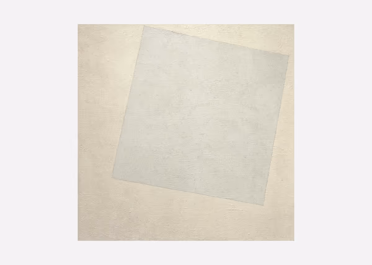
This perspective finds its roots in a deeper, more philosophical understanding of "white," famously articulated by the designer Kenya Hara in his work White.
Hara explores the Japanese character 白 (shiro), which means not only the color, but is also a state, a void brimming with potential. It is a point of origin, an emptiness that functions as a vessel, ready to be filled by the thoughts and perceptions of the viewer. This concept is fundamental to the way we choose to frame the artistic voices represented by Lebled Soloviev.

When he chooses to leave a page largely unprinted, Zachrisson is making “an active design choice,” he says. We are not withholding information; we are offering an invitation. We are creating a sanctuary of purity and withholding that allows the reader to enter the work without the noise of over-explanation or decorative clutter. By providing this emptiness, we respect the reader's ability to navigate the artist's world on their own terms.
The visual experience of a book has its analogue in a spoken monologue. If a speaker delivers a stream of words without pause, the meaning becomes a blur; the nuances are lost in the momentum. It is the silence between the words — the intake of breath, the deliberate hesitation — that gives the monologue its emotional gravity and structure. In a visual narrative, white space serves that purpose. It provides the breath between images, allowing a single photograph to settle in the viewer's mind before the next one speaks.
This rhythm is essential for an unhurried experience. By carefully controlling the tempo of the pages through the placement of empty space, we create a narrative arc that respects the complexity of the art it surrounds.

This withholding is an act of confidence. It requires a certain courage to leave a page quiet, resisting the urge to fill it with supplementary text or secondary graphics. This discipline is guided by Daniel’s core philosophy, borrowed from jazz musician Thelonious Monk: "Mean every note."
In book design, every millimeter of white space is a "note." It must be played with purpose and resolved correctly within the coherent concept of the volume. When we frame an image with wide, deliberate margins, we are making a choice to elevate the essential. We are signaling that the work is significant enough to deserve its own territory, isolated from the distractions of the outside world. This creates an atmosphere where the subtle details of an image — the particular grain of a film, the fragility of a shadow, or the intensity of a gaze — can resonate with visceral clarity.
For Lebled Soloviev, the use of white space is also inextricably linked to the materiality of the book itself. In our editions, "white space" is synonymous with the visibility of the paper itself. We do not view the paper as a neutral substrate, but as a medium that carries its own inherent meaning. As Daniel notes: "How the paper reflects light, how it feels to the touch, whether it leans towards yellow or blue — all of this carries meaning.”
For Daniel, the paper “anchor(s) images in the physical world.” When the light of a room hits the unprinted surface of a page, it reflects differently than it does off the ink. The texture of the stock, the subtle variations in its tone, and the way it feels under the thumb all contribute to the sensory reality of the object. By allowing the paper to remain visible, we are showcasing the integrity of the craft. The white space becomes a tactile reminder of the book’s existence as a permanent landmark.
We find ways to let images speak for themselves, ensuring that the frame remains sophisticated and invisible. This is not about being austere for the sake of a high-brow aesthetic; it is about providing the necessary distance for the art to be truly seen. The silence on the page is what protects the integrity of the artist’s vision, ensuring that their voice remains clear and undistorted.
Ultimately, the goal is to reach a level of purity where the design and the content exist in a state of perfect, disciplined tension. By embracing the philosophy that "silent is eloquent," we move beyond the superficiality of decoration and into the realm of intentionality. We are crafting a visual language that values clarity over volume and depth over density.
This commitment to the "eloquence of the void" is what defines the Lebled Soloviev experience. It is a reminder that in the space between the notes, and in the margins of the page, lies the true heart of the narrative.
As Zachrisson says, “whiteness is never about nothingness.” By honoring that space, we ensure that every book we produce is not just a collection of images, but a quiet, enduring vessel for the stories that move us. Through this thoughtful framing, we allow the art to breathe, to linger, and to take its rightful place in the cultural memory of the reader.